Emma Mathewson is an
illustrator, writer & comic
artist living in the
United States.

︎ Timeline: 2 Weeks
︎ Team Members: Just me!
︎ Tools used: Figma, Figjam, and Adobe Photoshop
︎ Team Members: Just me!
︎ Tools used: Figma, Figjam, and Adobe Photoshop
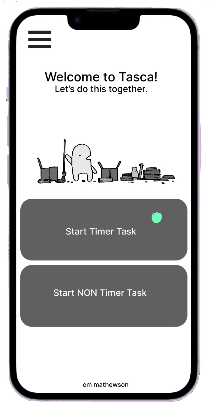
Tasca was built as a task managing app for people with ADHD. Designed to not overcomplicate, Tasca gives users the tools they need and only the tools they need.
Discovery Stage
I started by conducting user interviews to better understand not what I thought the problem might be, but what actually was. I interviewed 3 users with ADHD and tried to understand what actually prevented them from completing tasks. I got these answers:
-
“The amount of tasks I have to do paralyzes me.”
- “I get distracted because I get bored.”
- “Not completing tasks that affect someone makes me feel bad.”
PI then made an affinity map of these insights, along with all the other ones. It helped reveal enough insights to develop a persona, a person born of data that helped maintain the humanity of Tasca’s audience.
What do we do with all this data?
What do we do with all this data?
We make a persona.

Finding Solutions
This is Riley. She's our persona for this project, and she's going to help us determine the needs of the average person who needs this app. Her needs are rooted in the "I" statements of the affinity map.
“I love my friends, and I love my job, but I can’t figure out how to accomplish everything in a day that I want to do. “
“I love my friends, and I love my job, but I can’t figure out how to accomplish everything in a day that I want to do. “

So how might we help Riley? Well, we come up with some statements to focus the design stage to her needs.
1. How might we create a way of forcing Riley to break up a large task into a smaller task?
![]()

2. How might we incentivize Riley to complete tasks rooted in her social want?
![]()

3.
How might we create a tool that integrates as fast as possible into Riley’s life?
![]()

User Flows
Here’s how. I created a user flow designed to gently force the user to break each task down, so that there's less effort being spent on figuring out how to tackle the big thing, and that effort can be spent on the smaller things.
Seen here, the first half of this user flow leads Riley as much as necessary.
Seen here, the first half of this user flow leads Riley as much as necessary.
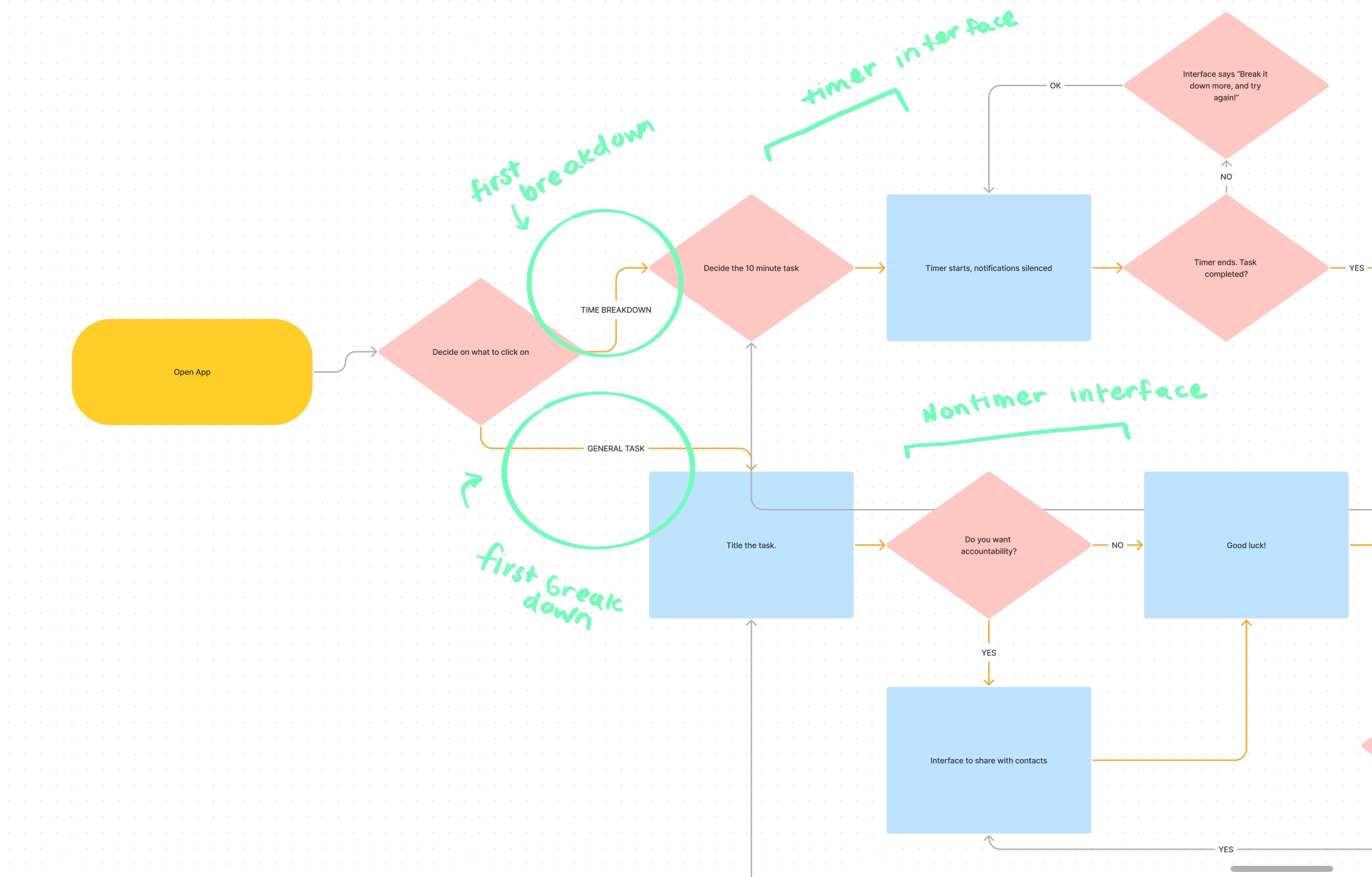
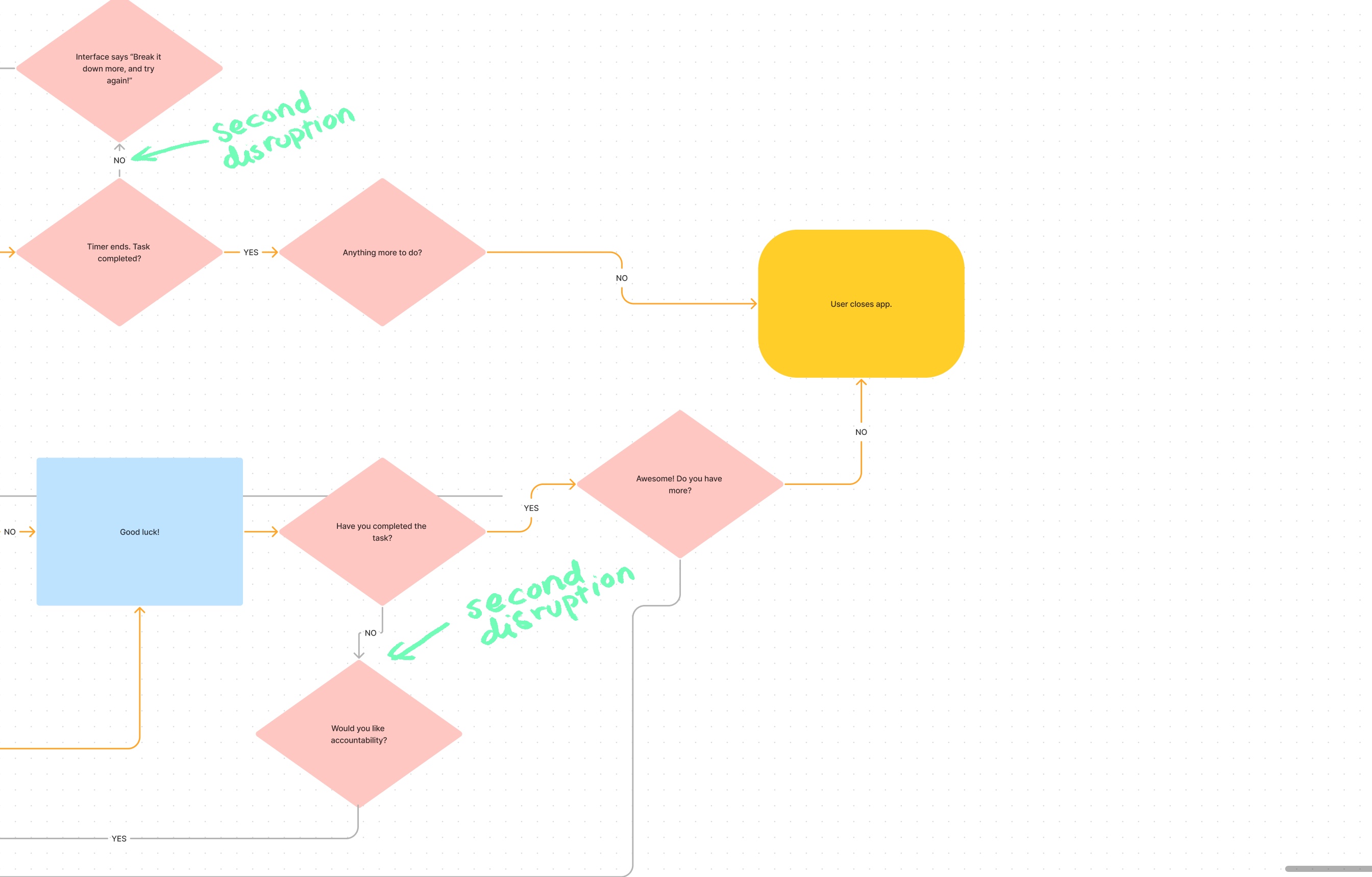
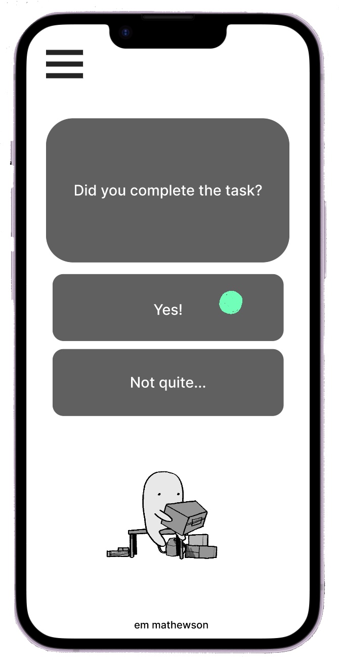
Where the second half accounts for user error in a normalized, non punishing way. When users fail to complete tasks, they are simply given ways to make the task even simpler, instead of adding guilt.
Inital Prototyping
A medium-fidelity prototype was then developed in Figma for usability testing. Three users were asked to
complete the following tasks in under 2 minutes with under 2 errors.
All users were able to do so without any errors, except one, who was unable to figure out how to progress to the next step without a start button.

Lets go through Tasca’s prototype, in two tasks.
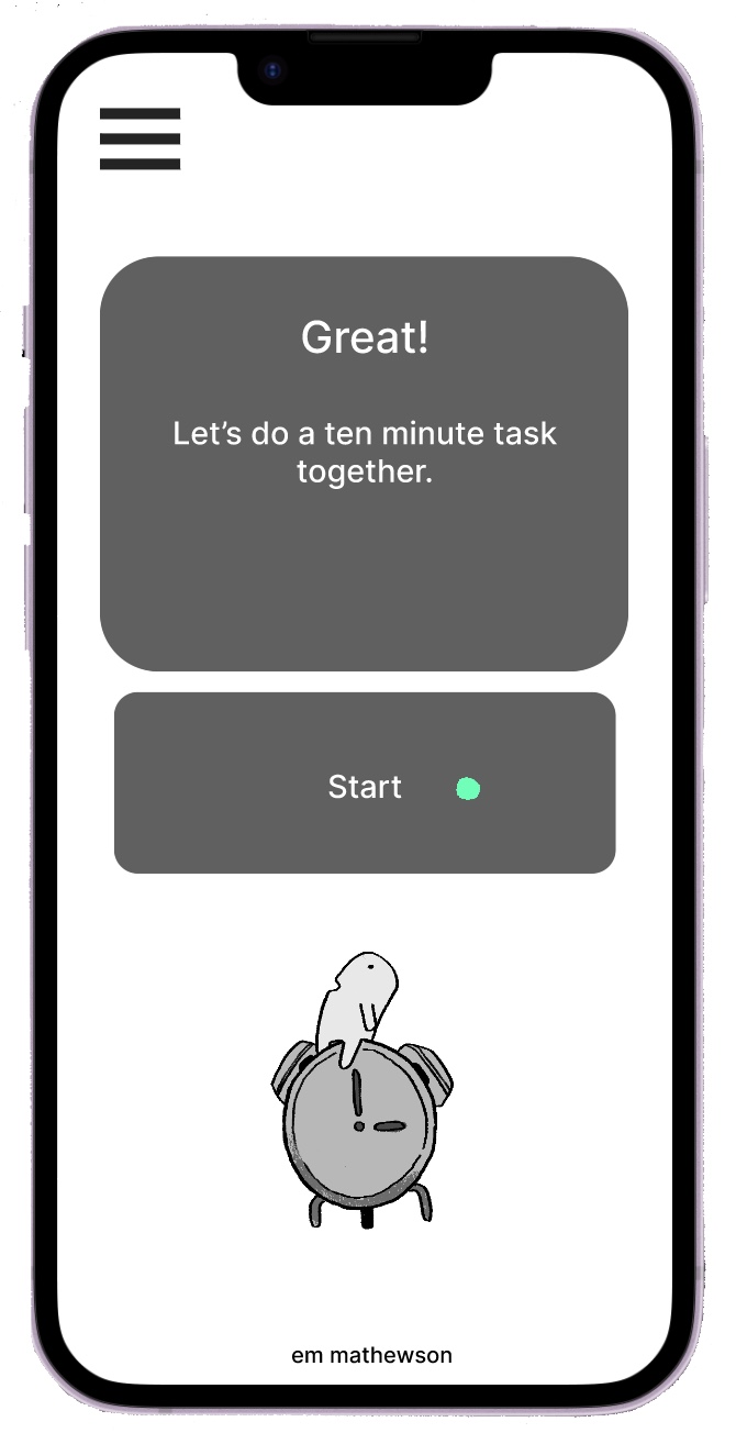
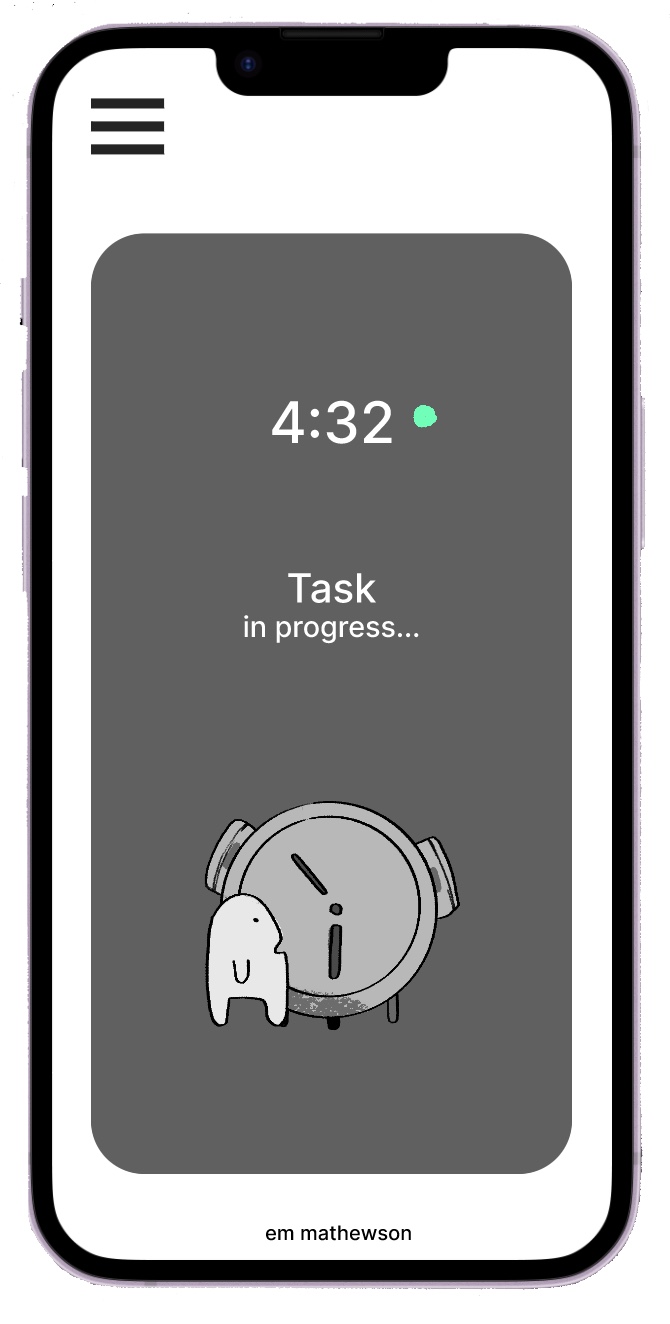
Task One: Make the bed, for as long as you need.
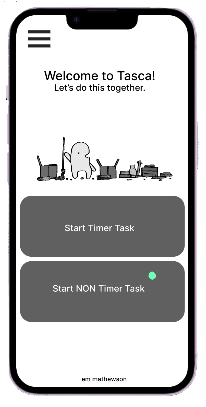

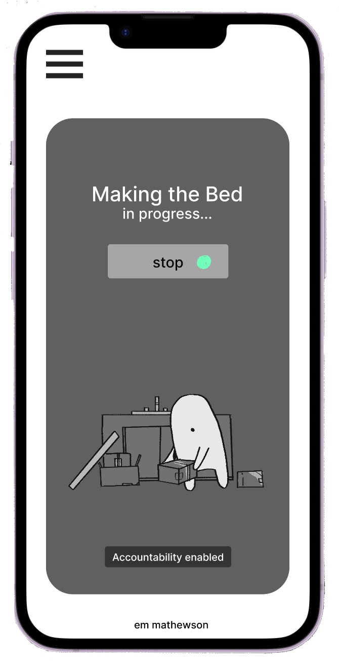
Task Two: Wash the dishes using the timer function.

Final Design

After completing this inital prototype I wanted to revamp all the visuals to fully serve Tasca. I wanted Tasca to be visually interesting enough that people would choose it to accompany them do tasks they would otherwise not do. And, of course, be fun.
Here’s what the app looks like after a full visual overhaul.
Here’s what the app looks like after a full visual overhaul.


Next Steps:
Tasca functions basically, but there are many quality of life features to add and account for. Those include: more complex task accommodations, additional timer settings, and streamlining the task circuit. Protoyping Tasca felt very natural, but the whole of it is still missing a lot of features. In getting messages from people who genuinely believe Tasca could help them with what they're struggling with, I really fell in love with UX/UI. For me, relief is the absolute ideal outcome of design, and I see no reason to stop working towards that.