Emma Mathewson is an
illustrator, writer & comic
artist living in the
United States.

︎ Timeline: 2 Weeks
︎ Tools used: Figma, Figjam, Adobe Photoshop, and Optimal Card Sort
︎ Tools used: Figma, Figjam, Adobe Photoshop, and Optimal Card Sort
︎ Team Members:
Em Mathewson (Just Me!)
Em Mathewson (Just Me!)
Discovery
Miller Nursery is a landscaping and plant nursery in Johnston, Iowa. It is also an actual current live website you can find here. While all signs point to the actual buisness being excellent in person, the website itself doesn’t quite work as a B2C site. In fact, there’s no actual ecommerce arctitecture here. They even say-- do not ask us to ship things!
But in this design sprint, I aim to design a site that works for Miller’s current community, all the while maintaining their voice of a old school family business.

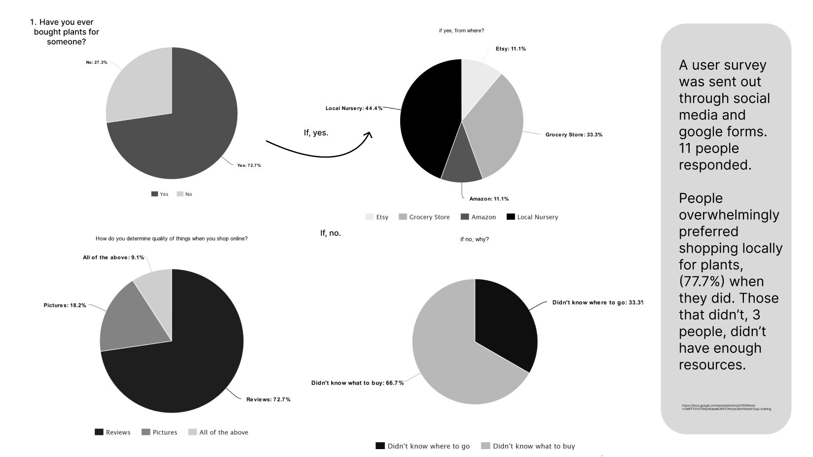
There’s a lot of potential pitfalls in shopping online at Miller’s new website! How do I know that? Well, because I asked users:
1. What do you do when you want to purchase gardening supplies? 2. What stops you from buying plants/similar online? 3. If you’ve never bought plants/gardening supplies, why not?
There were a lot of painpoints relating to a lack of trust: not trusting shipping, not trusting themselves to make the right choice, not trusting that the item is what they want.
These aren’t insurmountable problems.

Initally, I researched competitors and comparitors to understand the current standard of ecommerce specifically pertaining to the sale of plants and tools. Especially how they developed potential solutions to that perceived lack of trust.
They do that by:
They do that by:
-
Emphasizing reviews
-
Transparently displaying their shipping policies
- Reccomending relevant care items to specific products
Persona
We should also meet Jack. He’s a gift giver.
“I like giving plants to people because it makes a room or space so much brighter. But it’s hard to tell what’s the perfect plant for them without spending ages on it.”
Frustrations
- Jack cannot dig to get information- he doesn’t have the time!
- Overly complicated processes
- Not having a gifting checkout process
Likes
- Accurate recommendations
- Included gift wrapping in the checkout process
- Summarized reviews and descriptions with clear photos

How Might We...
Finding solutions for Jack was both straighforward and tricky. Efficiency was essential, but simplifying too much wouldn’t unitilize the space as well as possible. To help focus this process I came up with a few questions.
1. How might we create the most straightforward gift giving experience for Jack?
2. How might we allow for information to be communicated as quickly as possible on the website to Jack?
3. How might we integrate the gift giving experience naturally into Jack browsing the website?
The big problem...
Jack needs a way to shop for plant gifts locally as quickly and easily as possible because he’s too busy to do it another way.
User Flows
Two user flows were developed to emphasize the gifting experience alongside the general site experience. I wanted to prioritize Jack’s gift

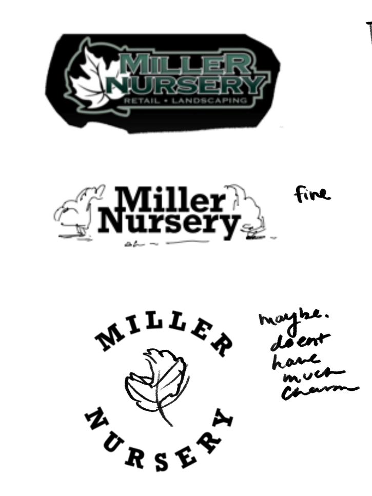
Inital Designs
The inital designs I did worked branding wise, but weren’t cohesive with the site as a whole.
I initially felt very lost on the project’s artistic direction, not trusting my instincts enough and getting too focused on the HMWs. Sure, the website needed to be function to Jack, but it also has to represent the vision of Miller Nursery. I reviewed the about section on their website and settled on three characteristics I wanted to emphasize.
1. Vintage values and look. Miller’s been around since ‘66, it’s not a startup, it shouldn’t feel overly sleek.
2. Personable. Miller wants to focus on the community around them and the people in it. Translating that to ecommerce should emphasize humanity.
3. Ease of use. A wide range of people are going to be using this site, and I want it to be clear above all else where to find things.
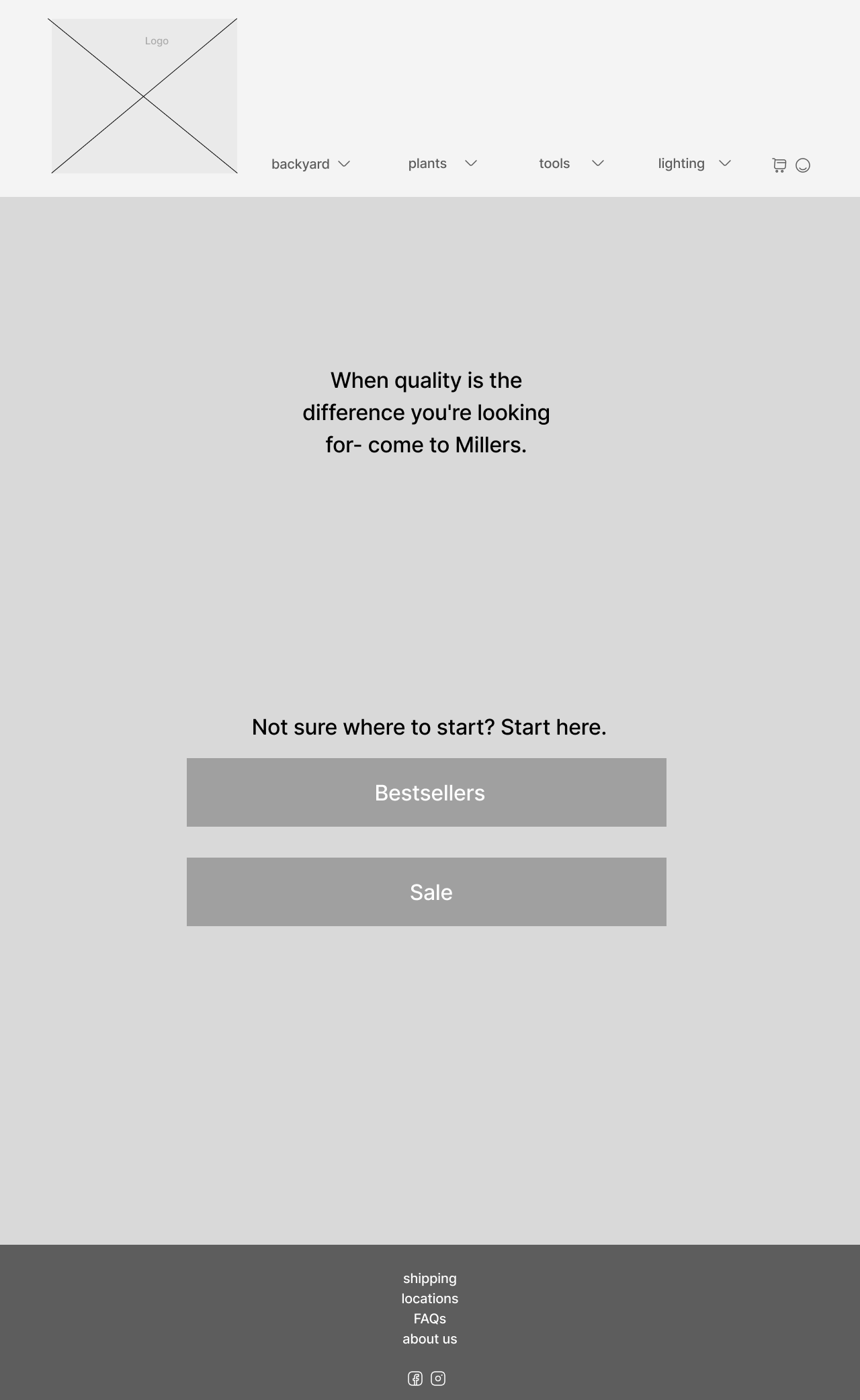
Inital Wireframes and Notes:
![]()
![]()
- Homescreen layout is really utilitarian
- Composition doesn’t serve the consumer

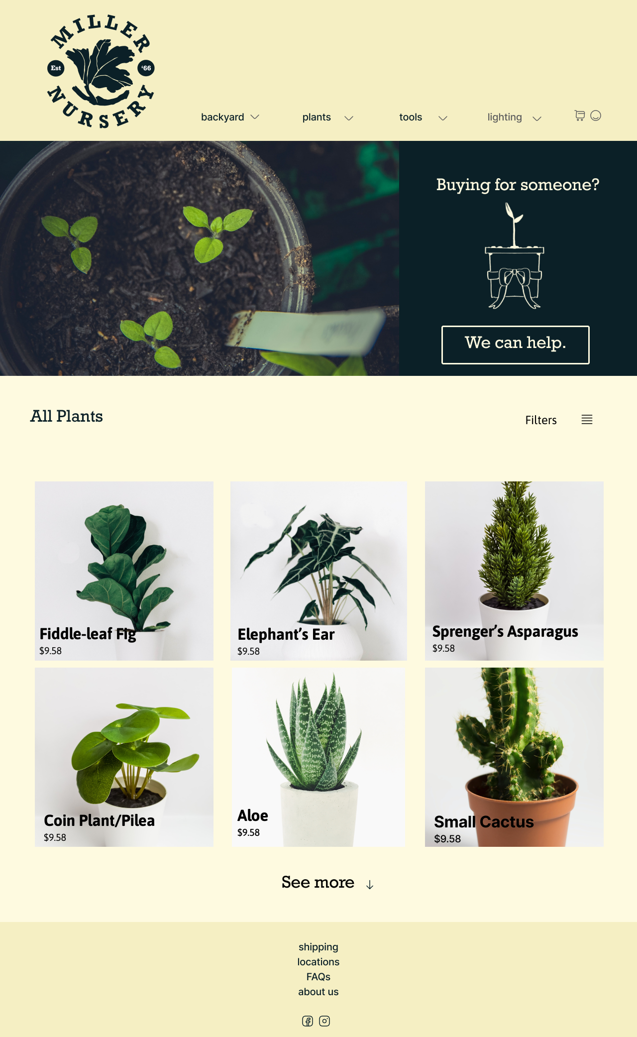
Inital Prototype after User Testing:
![]()
![]()
- Prototype works to get people to the product page, but very little information is able to be conveyed.
-
Branding is unfocused
- Too saturated

Protoype after critique and solidifying vision and intent:
![]()
![]()
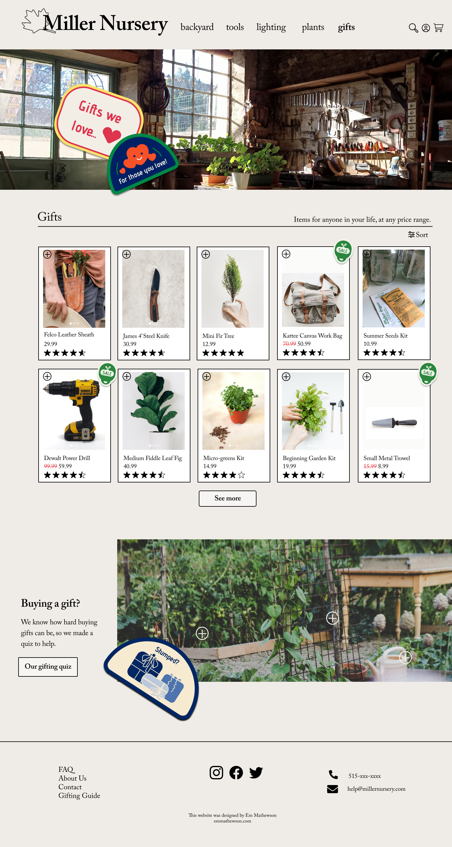

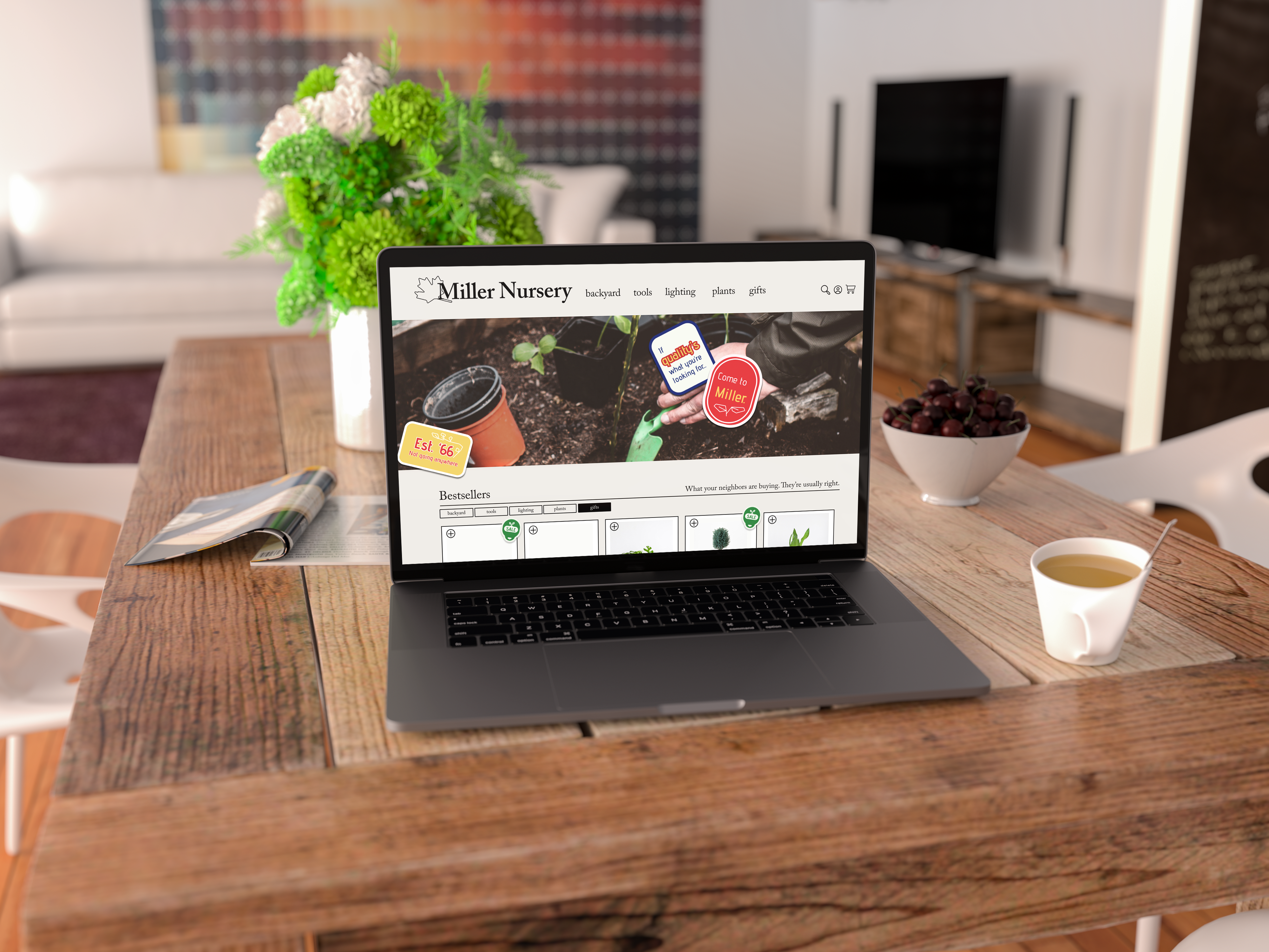
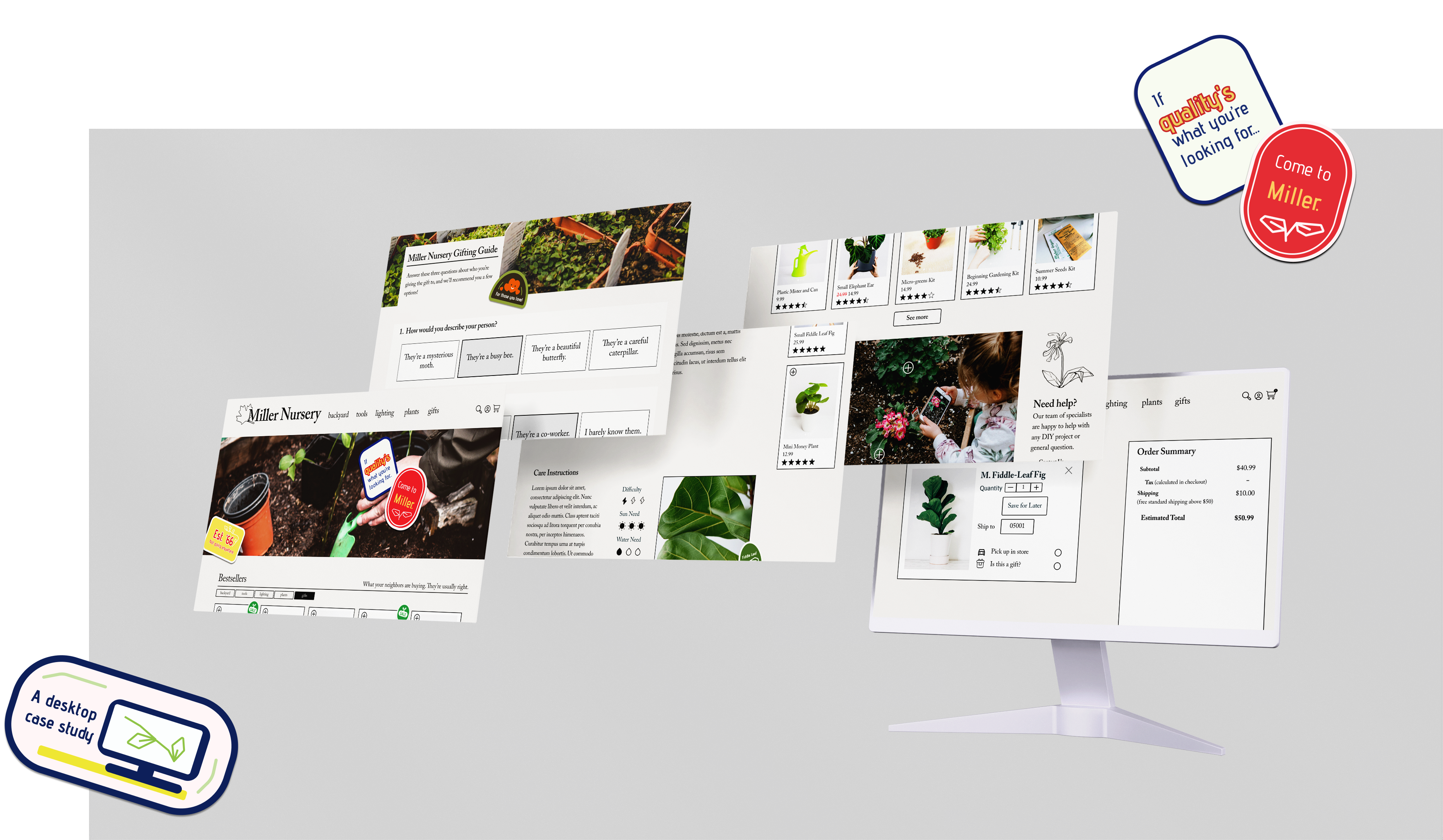
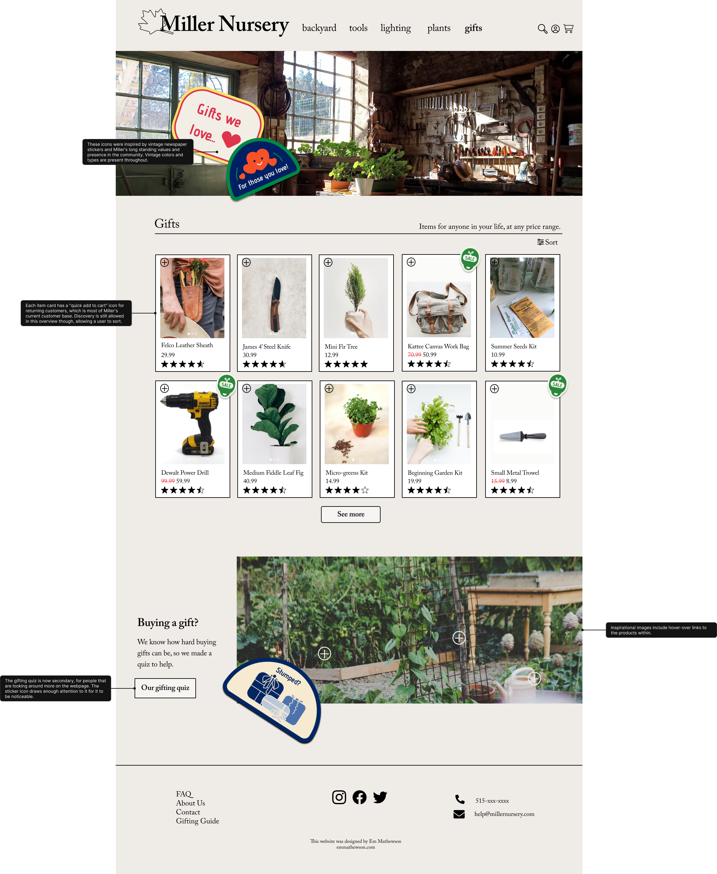
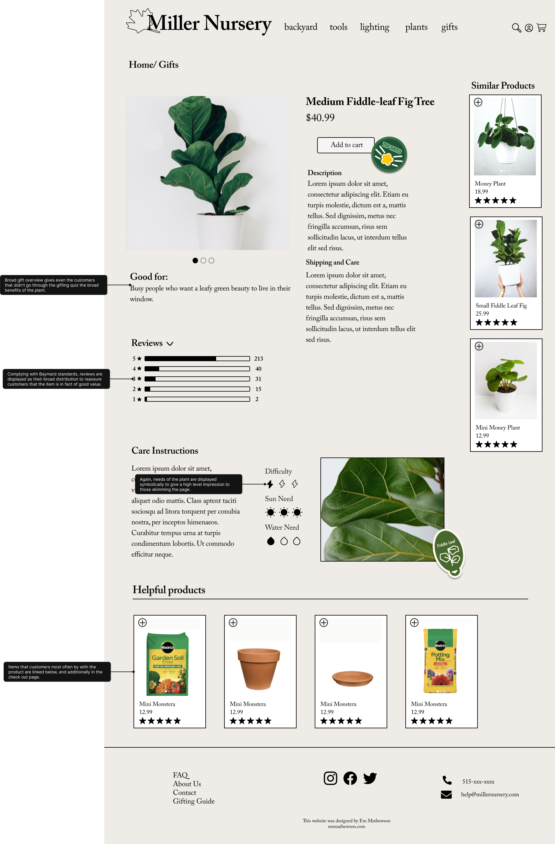
Final Prototype
Join me in walking through the final version of Miller Nursery’s website, from homescreen to product page. Annotations are provided.
Just a reminder of what it used to look like:
![]()

Next Steps and Learnings
This case study really battled me-- I was so focused on the research that I forgot my design instincts until the very end. I learned that after figuring out HMWs and basic wireframes I need to stop solutioning and start designing, very clear cut. Otherwise, honestly, I wouldn’t have finished this project.
As for next steps:
1. Miller Nursery needs a mobile layout with an adaptive design. My basic layout converts roughly, but I’d recommend cutting some elements when converting to mobile.
2. Make the customer service and shipping centers of the website really informative and reassuring, so nobody, like those in the inital survey, feel lost.